Change Choice Prompt appearance in Azure Bot Services
 March 19, 2021
One of the most important reasons we use chat-bots to convey information to the user, is that we are aiming to provide the best possible interface, convincing the user to experience our application because is easier and more fun to use. With this in mind we come to the realization that interface is key to what the user perceives as a good application and would like to spend any time using it.
Helping us on this task are Choice Prompts, which provide a set of pre-determined answers to the user to choose from. This not only makes the job of the developer easier but the user’s as well. Developers does not need to think about every possible answer, only the ones given to the user beforehand and users can have answers suggested by the interface itself, so they do not need to think about what to say. (If you would like to create your own Choice Prompts you can find how to do it here.)
However what might look as an incredably helpful tool, is as helpful as the interface displaying it. The appearance of the prompt, makes a big difference on weather the user will enjoy it or not. This is where ListStyle comes in handy. This option provides you the ability to customize the appearance of your choice prompts and choose the one best suited to the application you have in mind.
Let’s have a look on all the options available:
- auto: Automatically select the appropriate style for the current channel.
- heroCard: Add choices to prompt as a HeroCard with buttons.
- inline: Add choices to prompt as an inline list.
- list: Add choices to prompt as a numbered list.
- none: Don’t include any choices for prompt.
- suggestedAction: Add choices to prompt as suggested actions.
With this provided information I decided to try all the options on common used channels. The channels I selected are the Web Chat and Microsoft Teams. I will also have available the appearance inside the Emulator to help you out.
No Style
return await stepContext.PromptAsync(nameof(ChoicePrompt), new PromptOptions { Prompt = MessageFactory.Text("No Style"), Choices = choiceList }, cancellationToken);

This is how your choice prompt will look without any ListStyle option selected. As you can see, despite having all the options as buttons in the emulator and web chat, Microsoft Teams displays only a list and the user is expected to write the number corresponding to his/her choice. Have in mind that the appearance might change depending of the amount of answers you need to display.
Auto
return await stepContext.PromptAsync(nameof(ChoicePrompt), new PromptOptions { Prompt = MessageFactory.Text("Auto"), Choices = choiceList, Style = ListStyle.Auto }, cancellationToken);

Auto seems to work exactly like not choosing any style option, as you can see above.
Hero Card
return await stepContext.PromptAsync(nameof(ChoicePrompt), new PromptOptions { Prompt = MessageFactory.Text("Hero Card"), Choices = choiceList, Style = ListStyle.HeroCard }, cancellationToken);

Although Hero Card might look a bit bulky ine emulator and web chat, in Microsoft Teams it looks exactly like the rest of the channels in the previous examples. Which in my opinion looks really intuitive for the user.
Inline
return await stepContext.PromptAsync(nameof(ChoicePrompt), new PromptOptions { Prompt = MessageFactory.Text("Inline"), Choices = choiceList, Style = ListStyle.Inline }, cancellationToken);
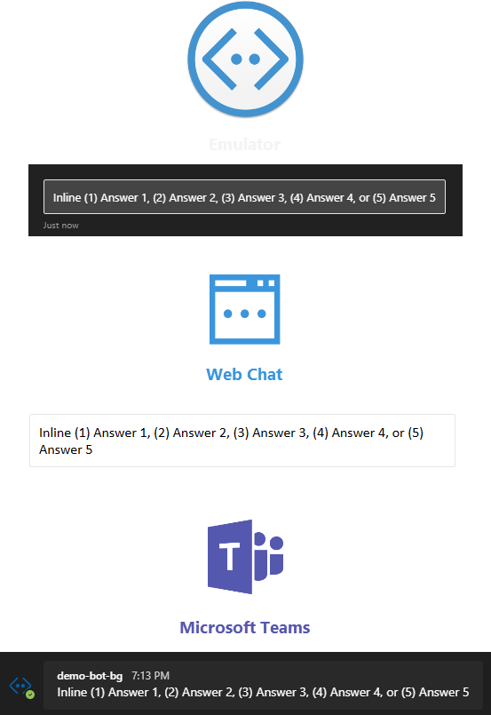
Inline has the same appearance throughout the different channels. However, in my opinion, it should only be used in cases where the available space that the bot interface is displayed on is limited.
List
return await stepContext.PromptAsync(nameof(ChoicePrompt), new PromptOptions { Prompt = MessageFactory.Text("List"), Choices = choiceList, Style = ListStyle.List }, cancellationToken);
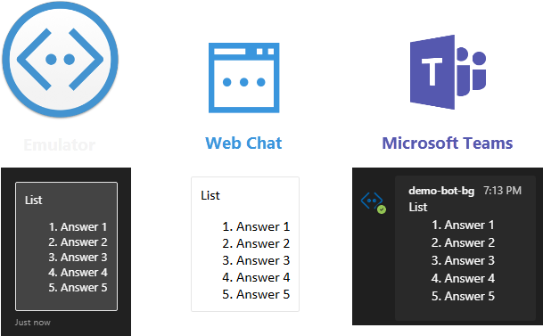
List is also consistent throughout hte channels and it provides a numbered list, expected from the user to write the number corresponding to his/her choice. In my opinion this is not ideal, but it can be useful when there are too many options available.
None
return await stepContext.PromptAsync(nameof(ChoicePrompt), new PromptOptions { Prompt = MessageFactory.Text("None"), Choices = choiceList, Style = ListStyle.None }, cancellationToken);
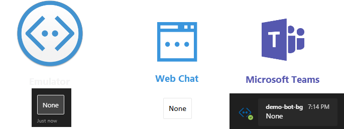
None is not helpful in our case because it does not provide any answers to the user.
Suggested Action
return await stepContext.PromptAsync(nameof(ChoicePrompt), new PromptOptions { Prompt = MessageFactory.Text("Suggested Action"), Choices = choiceList, Style = ListStyle.SuggestedAction }, cancellationToken);
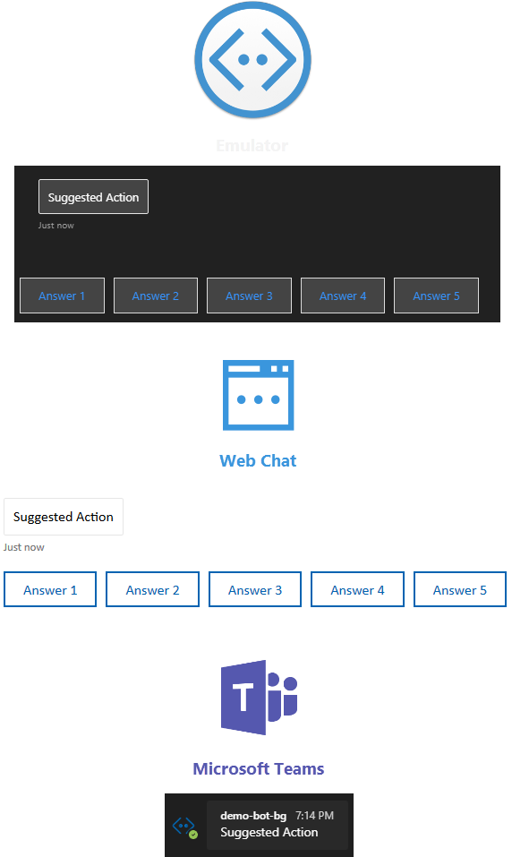
Lastly, although Suggested Action looks good in emulator and web chat, in Microsoft Teams no answers are provided rendering it much less desired than the rest of the options.
I hope this helps you decide which ListStyle is better suited to your use case to help you achieve the best interface possible!